Experience maps and customer journey maps are vital tools for innovation, design, and insights teams. When done well, they become viral packets of information that shed light on the nuances of the simplest or most complex experiences. We have seen them plastered at every employee's desk, or filling teams hallways as a permanent fixture - reminders of the customers that teams serve, and a sense of place for where their own work might be impacting the end user. These research artifacts are some of our favorites to create and teach, using our 5E Framework for Experience Mapping as the scaffolding and starting point.
We recently hosted a Chicago Design Week event to share some of our own experiences creating customer journey maps. One of our favorite questions during the event was: “what are some of the most common mistakes people make on journey maps?”
It turns out there are more than you’d think! We decided to compile a list of some of the most common pitfalls and offenders.
Being Narrowly Focused on the Product
Our 5E Framework lays out a starting point to parse elements of a journey or experience into 5 buckets as a starting point: Entice, Enter, Engage, Exit and Extend. However, it’s not uncommon for us to see journey maps that have focused entirely on the moment of “Engage” - getting too caught up in the specific tasks and interactions with their own product or service. When we focus too narrowly on the product or brand engagement, we leave behind the critical elements that set expectations for the experience (in Entice and Enter) and that dictate whether or not the experience is memorable enough to have staying power (Exit and Extend).
Failure to Rename Buckets
You have 5 buckets! Yay! But wait, are those the right 5? Are there some elements that need to be broken out further? Probably. Like all frameworks, this one is meant to be a solid starting point to get you going and thinking end-to-end. But sometimes people forget the critical step of renaming their categories to better match the journey being mapped, and to take a close look at the buckets. Are some really packed full? Maybe they need to be broken out further.
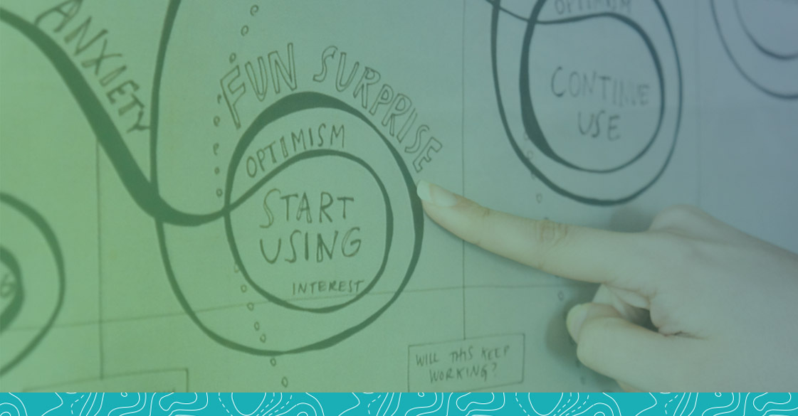
Monotone in Emotion
We see this one a lot - journey maps filled with general emotions, positive and negative signs or maybe even ambiguous emojis. Or even worse, you might find an experience driven entirely by pain points that omit the crucial things to be learned from the bright spots. Great journey maps dig deep to unearth user language, body language, facial expressions, tone of voice etc. and become emotionally intelligent. A tick mark or happy/sad icon cannot possibly convey the subtext between shame and relief, or when confidence may be very different than pride or skepticism is different than uncertainty.
Stylistically Inexpressive
How many customer journey maps have you seen that are full of boxes and arrows and an oversimplified axis? This formulaic design trap can result in many customer journey maps looking basically the same, which may very well leave teams uninspired. But how do you fix it? We try to ditch the linear and sterile visuals and opt for abstract and expressive visual language to communicate the key points of a journey. We stop and ask ourselves - “what does this step or process FEEL like and LOOK like?” If there is tension, can we visualize it? If there is uncertainty or back-tracking, can we show that through broken lines?
Omitting Divergent Pathways
Synthesis is already hard - but it is also possible to over-synthesize. With customer journeys, the biggest mistake is forcing multiple different experiences and pathways into an oversimplified and prescribed single path that may not be authentic to the data. Where do people choose to abandon an experience and why? When and where do they back-track or skip steps? Are there areas where experiences diverge and converge? A recent customer journey map we created for a client embraced the mess of multiple pathways. These alternative pathways ended up being a critical finding. They revealed new customer types and even a future customer segmentation model.
Ignoring the Context
The very same core of an experience can be dramatically changed based on environment and context. Buying a car might feel very different as a first-time buyer taking your time to do it right compared to an urgent need after a bad accident. Using a kiosk to check-in for a queue can feel very different depending upon where you are: at the airport, at the doctor, or at a wireless phone store. Even identical products or process may carry on different meanings: self-injecting hormones in hope of becoming pregnant feels different than self-injecting medication to head off a migraine or an allergic reaction to a bee sting.
Forgetting the Experiences of Other Stakeholders
Not everyone involved in an experience has the same role, sees it the same way, and has access to the same tools and information. A doctor, nurse, patient, caregiver and insurance company experience the moment of diagnosis of a chronic disease very differently. The same moments take on different meanings. How do they overlap, align, diverge? When experience maps need to reconcile these complex perspectives, it's rarely possible to accomplish everything in a single graphic, but the journeys of these stakeholders should also not be siloed.
Now we've told you what NOT to do, so let's flip that!
The Best Customer Journey Maps Are:
- End-to-End: Capturing the entire journey, before and beyond your product/service
- Original and Authentic: Move beyond the basic formulas and starting points
- Emotionally Literate: Get specific with word choice, emotions and user language
- Visually Expressive: Squiggles, loops, icons and purposeful visual language goes a long way
- Including Chutes and Ladders: Don’t shy away from the alternate pathways, bail points and recurring loops where people get stuck, skip ahead or backtrack
- Contextually Aware: Surface reminders of the environment and context surrounding the experience - Bridging differing points of view: Play nicely and connect back to the unique journeys of other key stakeholders
- Bridging Differing Points of View: Play nicely and connect back to the unique journeys of other key stakeholders

Want to continue the conversation? Follow us on Twitter and don't forget to tag @ConiferResearch!